‘Color’ is far too vast of a topic to ever really dive into. It’s the entire makeup of the world around us, it’s perception, it’s mood, it’s light. It’s a simple, concrete idea that kids understand before they even learn the alphabet, and yet its incorporeal– intangibly fleeting our grasp and morphing from the moment the sun rises till long after it sets. As a painter, my relationship with color is ever evolving, ever growing. Color is emotive, symbolic. But it’s also science. It's also history. It’s deep time. It's actually a whole bunch of other things that you wouldn't expect it to be. It’s from this platform that I choose to dive into the vast sea of color. Hope you brought your swimsuit.
Back in the spring I began working as the first ever Materials & Techniques Lab Technician in the Painting and Drawing Department at The School of the Art Institute of Chicago. I am in charge of a unique, one-of-a-kind space called StudioLab, which houses the curricular hub for all painting and drawing materials and techniques courses. When I was a student, this space was just a regular classroom, but it’s been built out to accommodate the exact needs of the study– think chemistry lab meets commercial kitchen meets painting studio. We’ve got a state of the art ventilation system, drafting tables that adjust from totally horizontal to totally vertical, a counter video camera for demos that projects onto a large screen, baking racks for horizontal storage of small works and explorations, and most excitingly, a ductless fume hood designated for handling pigment and particulate matter. It’s a dream job to say the least. The last several months I’ve been learning, learning how much I have to learn, getting shit done, and also learning.
Getting StudioLab whipped into shape for students to return to school this fall was an absolutely daunting endeavor, and with my job being a brand new position and all, it’s a path that I’ve been carving out for myself step by step. I began my process of inventory, organization, purchasing, structuring, and making the space my own with the most quintessential cornerstone of art: color. StudioLab currently has an inventory of approximately 40 different dry particulate pigments as well as around 65 liquid pigment dispersions. All these pigments are accessed by a minimum of 70 students, 4 faculty members, 5 teaching assistants, 1 technician (that’s me) and 1 StudioLab monitor every single week (imagine sharing one refrigerator with 80 roommates!) There were two cardboard boxes with some duct tape labels that were used as a loose system of organization, but that was about it. A little bit of semblance and structure was definitely in order, and I was about to drunkenly fall off the diving board straight into the deep end in my search to create it.
The pigments stared me down, challenging me to define them, to put them into categories, to constrain them– they saw straight through me. How to even begin? A valid question indeed. After painting and studying materials and techniques for years, I had pretty proficient intuitive, working knowledge of the different types of pigments and how they operate. Some pigments are more or less potent when mixed with other colors, other pigments are heavier or lighter by volume, I knew all of this. But I didn't know why. I didn't have even the slightest grasp on the chemical makeup of these pigments that are so elemental to everything that I do and care about. I gathered up a fat stack of painting material books, strapped on my respirator mask, and got to work, one misplaced container at a time.
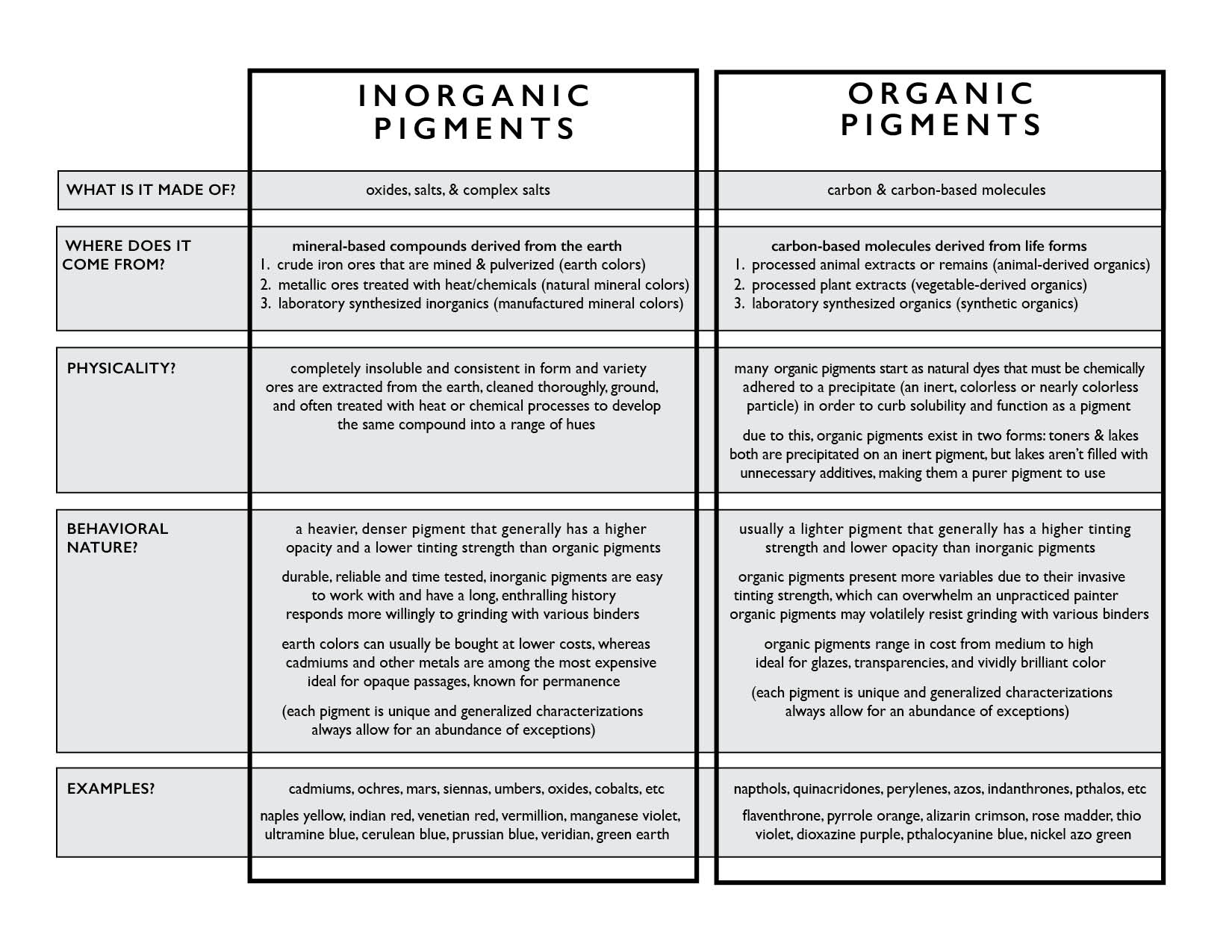
The first thing you need to understand about pigments (or anything, for that matter) is what the hell it is. As defined by Gottsegen in The Painter’s Handbook, “pigments are small particles of colored materials that are insoluble in water, oils, and resins. When suspended in liquid binders or vehicles, these colorants form paint.” Pigments, by definition, are not dyes in that they will not (usually) stick a surface without a binder, but rather they require a binder in order to adhere to a surface, hence paint. Simple enough. Pigments can be divided into two main categories, organic and inorganic. I've compiled a nice little table to help us map this out:
I worked one pigment container at a time, starting with Hansa Yellow. I leafed through all of my books, referencing and cross referencing, clicked through a wide row of internet tabs leading me to the sites of different paint and pigment manufacturers, learning the history, the process of manufacturing, the chemical make up, and the behavioral qualities of each unique, precious pigment. I learned to understand them in their own terms, to know their own stories. To introduce each pigment would take decades and countless volumes of books–I'll go ahead with a couple that I'm most excited about right now.
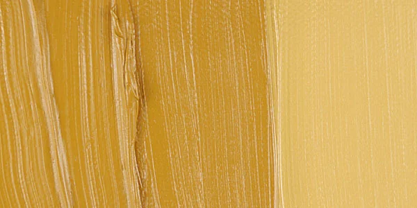
Ochre, and all its variations from light yellow to orange, is an inorganic earth color that comes from an iron ore called limonite or goethite, which is an iron oxide-hydroxide mineral. The deeper red and purple ochres, in contrast, are derived from hematite, or iron oxide. With the invention of the familiar screw cap metal paint tube compliments of Winsor & Newton in 1842 and the boom of dyes in the textile industry, demand for pigment and paint intensified as a commodity for artists and businesses. This, among other factors, put pressure on facilities that were manufacturing pigments. Roussillon, Vaucluse in the Provence-Alpes-Côte d'Azur region of southeastern France is famous for its ochre quarries, and while extraction of ochre ceased in around 1930, the quarries are open for tourism to this day.
Top left: Roussillon, Vaucluse Ochre Quarry – Top right: Ochre dry pigment – Bottom left: Gamblin Yellow Ochre oil paint tube – Bottom right: Yellow Ochre paint swatch with tint (images compiled from Google)
Next up is one of my all time favorite pigments–and if you've checked out my paintings, you know how I love my greens! Terre Verte is an inorganic pigment derived from a natural greenish clay, which is colored by iron silicates containing potassium, magnesium, and traces of other elements. This historical pigment dates back to the earliest recorded times, often referred to as Verona Green due to the deposits near Verona, Italy. The pigment grinds into oil and other liquid binders very readily, and takes on a much darker value than its usual light greenish-gray when wetted. I have recently been exploring its unique ability to act as both a modifier and a pigment in Conté Crayons, which are bound by ball clay. Terre Verte is also used as an inert pigment, or precipitate matter, to which organic dye is adhered to form a lake pigment. I've been doing research and experiments to explore the pigment's qualities based on its clay origins, and am excited to see how that unfolds.
Left: Terre Verte dry pigment – Right: Winsor & Newton Terre Verte oil paint tube (images compiled from Google)
The more histories and origins that I turned over, the more I wanted to learn. All I wanted to do was leave my nose in my book until my mind was filled to my heart's desire, but duty called. I had a lab to whip into shape, and school was less than a month away. Decisions had to be made, and ready or not, it was my job to make them.
I brainstormed physical ways to encapsulate all of the pigments. We started with more than 20 gallons (yes, you're reading that right) of about 40 different dry pigments divided stored in pint and quart sized containers in the cabinets beneath our pigment station. After taking inventory, consolidating, and organizing, I decided to get 6 oz containers that stack and lock together to line the interior walls of the ductless fume hood. This way, everyone could see the vast array of pigments in our supply and could access them directly within the station rather than digging through the cabinets below, sifting through the dozens and dozens of containers, and then lifting the containers up into the hood from the shelves underneath.
Top left & right: 6 ounce stacking, locking dry pigment containers lining walls of work station
Top: ductless fume hood work station – Bottom: back stock storage of dry pigments and particulate matter
Then, I moved on to our liquid pigment dispersions– pigment dispersions are an incredible development that allows pigments to be purchased in liquid form. The particulate pigments are suspended in a water-based surfactant that you can mix directly in with any water-based paint binder. Not only does this save tons of time grinding pigments into binders, but it's also way safer because it eliminates the hazards associated with inhaling or otherwise ingesting particulate matter. Super cool stuff. While you can find this product at most professional fine art companies, Guerra Paint & Pigments located in NYC really specializes in dispersions and manufactures a consistent, incredible product with an unbelievable range of pigments. Because of the added benefits of both safety and convenience, our pigment dispersion inventory is quite vast, and utilized by students every single day. I decided to invest in some specially sized glass racks used in industrial dishwashers (who would've that my side job as a server would come in handy). Each pigment has its own compartment, each compartment holds two 8 ounce bottles (the current bottle and one backup), each rack has 25 compartments, and we have 3 racks to contain our dispersions.
Top left: Dispersion rack overview – Top right: vertical closeup – Bottom left: Dispersion racks stacked in cabinet – Bottom right: Label closeup
All of our pigments are labeled with their name and index number, and all those from Guerra, both dry and liquid, are labeled with the pigment name, index number, opacity, and tinting strength. I used Guerra's system of numbering for our own purposes of internal labeling:
OPACITY: VT=Very Transparent T=Transparent L=Low M=Medium H=High
TINTING STRENGTH: 1=Poor 2=Fair 3=Good 4=Great 5=Excellent
The organizational structures are one thing, but the labeling is key. Reading the labels before choosing or accessing a certain pigment passively instills in students the sort of decision-making processes that should go into choosing a pigment: What type of pigment is this? What does that mean? How will it sit on the surface, will it be transparent or opaque? How will it behave when I mix it with other pigments?
Why do these things matter? Because if you know the answers to these questions, you will have an infinitely broader vocabulary to say everything you need to say as clearly as possible. And if you have things to say, it's your responsibility to learn the words you need to say it. After all this time swimming in the vast sea of color, I still feel like the shore that I jumped from is the only one in sight. Come on in, the water's fine.
“Almost every writer on the technology of painting points out the fallacy of the belief of some painters of the recent past that any close attention to the technical details of their craft would interfere with the free expression of their intentions, and that by concerning themselves as little as possible with such matters their creative efforts are left untrammeled. In one way or another, students of technique have shown that the work of the preeminent masters of the past was produced under conditions of the most highly developed craftsmanship; that the artists of the Renaissance made little distinction, if any, between their craftsmanship and their artistic intentions, and showed little concern for aesthetics entirely divorced from craftsmanship; that a firsthand knowledge of sound technique is of enormous assistance to painters in enabling them to express their intentions with accuracy; and that the knowledge that they have utilized the best possible means to attain their ends and to ensure permanence brings an increase of confidence.”


